Foot Locker
Reimagining a legacy brand’s UI sensibility alongside key content features.
Duration: 1 year
Role: Digital Experience Design, Branding
Tools: Figma

PROBLEM
Foot Locker was seeing an above average bounce rate for the site's homepage. Customers vocalized no emotional connection to the experience, describing it as pushing them to buy something, busy, and overwhelming.
E-commerce managers relied on an empty hero module that required brand designers to create .jpg assets including both text and images. This meant that content was not responsive and there was no live text to search engines and AI platforms. Content was also inaccessible to users relying on assistive technologies.
SOLUTION
This project began with infusing Foot Locker brand magic into the website experience through a strategic redesign of the brand's design system atoms. Leveraging these foundations, we delivered a suite of flexible, authorable content features designed to storytell around product curation, brands partners, and special projects.
Brand partners immediately responded to the launch of the redesign by granting access to engaging editorial photography assets. Introducing live text within these features was also an key upgrade, allowing the site to begin feeding search engines and AI platforms through homepage content. Live text also increased the site's accessibility. Most importantly for the business, the homepage saw a meaningful lift in conversion rate along with a decline in bounce rate.
01. Research
BENCHMARK USABILITY TEST
The UX Research team conducted a benchmark usability test with the goal of establishing a baseline of how users thought and felt about the existing site, including the brand story from the homepage.
OPPORTUNITIES IDENTIFIED
A high bounce rate, above the industry average
Users vocalized no emotional connection to homepage experience
Users described the homepage as trying to get them to buy something, busy, and overwhelming due to the amount of information
Users associate Footlocker with nostalgia and fond memories from their past, especially the '90s and '00s
LANDSCAPE RESEARCH
Rooted in the findings of the benchmark usability study, I explored and documented the homepage storytelling experiences of market leaders and leaders in the streetwear space.
Alongside building block features such as hero carousels, secondary placements, and banners, I discovered features designed for elevated storytelling:
Prominent editorial images, at times paired with product cards
Scrollable shoe walls mimicking an in-store browsing experience
Placements dedicated to hot sneaker releases
Integrated motion was also a key element of standout experiences

I also honed in on Foot Locker’s association with nostalgia and gathered inspiration from the brand's print advertising archives, as well as current day digital experiences that integrated hits of nostalgia.

02. Define
HOW MIGHT WE…?
As I moved into concepting, I defined how might we…? questions that synthesized the opportunities that had emerged from the team’s and my own research. These questions helped focus the strategies that would be included in my concepts.
A. How might we reduce visual clutter and focus users on key marketing stories and calls-to-action?
B. How might we connect with users emotionally?
ASPIRATIONAL CONCEPTS
I created and refined aspirational high-fidelity wireframes in close collaboration with our Director of Experience Design. These concepts helped us get all teams aligned on investing resources throughout 2025 to design and develop new design system elements and authorable content module features.
Strategies to focus users on key marketing stories and calls-to-action:
Create visual hierarchy through scale of content and typography
Create visual separation between content modules though white space
Net new features that allow for innovative storytelling
Strategies to connect with users emotionally:
Spotlight editorial photography, while pulling back on the use of graphics
Evoke nostalgia though hits of nostalgia-inspired UI
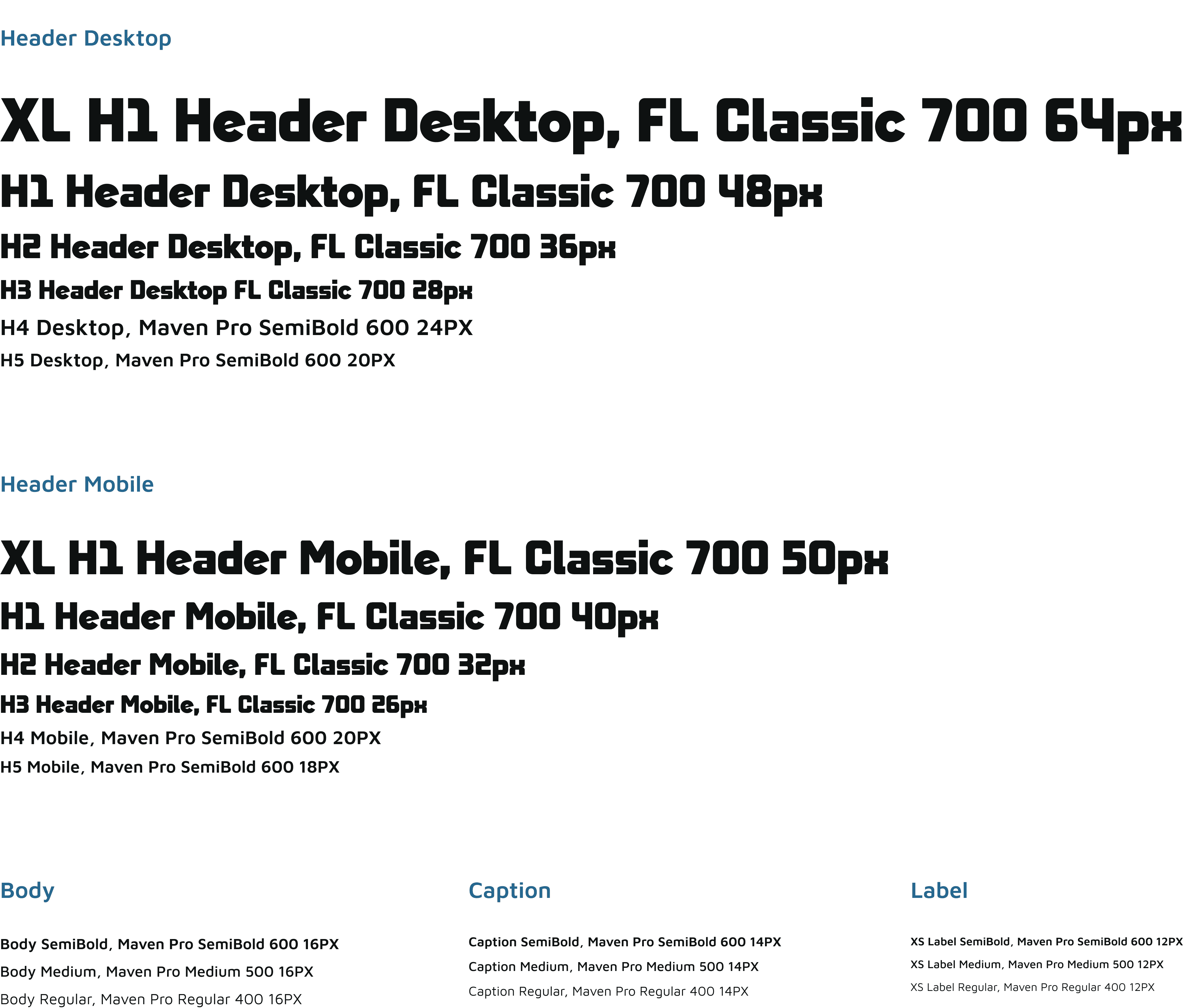
CREATING ATOMS
My next step was to collaborate with the rest of the product design team to create reusable type styles, buttons, and controls that would serve as the atoms for our new content module features. The elements would also be applied to the rest of the site.

FEATURE DESIGN & DEVELOPMENT
The project was then officially designated to a product pod and we collaborated with global e-commerce teams to define requirements for eight authorable content module features. These features were divided up between me and the other designer on the team.
Throughout 2025 we tackled each of these features individually, gradually rolling out a suite of flexible, authorable content features. These features utilized our new design system atoms.

03. Test & Finalize
USABILITY TESTING
Our team’s UX Researcher conducted user interviews around the refreshed homepage experience to ensure it was resonating and meeting the goals we had outlined for ourselves. The overall sentiment from customers was positive with individuals communicating they could see clear paths to shopping.
"I just feel like it's what I expect to come to a site like Foot Locker and see...it's familiar to me. [It’s] slightly comforting just because it's a brand that I know I've shopped at before. It makes me feel like I'm walking into a Foot Locker store..."
"It's very modern looking all around. I can see exactly what I'm supposed to do right away… So really this is everything that I expected to see in coming to a shoe site. I actually think this exceeded my expectations..."
"All of the photos stand out. They definitely grab my attention, and the new releases that are featured stand out. I also like that there's a separate [area] for popular brands. Like you could see all the Nike shoes and so forth."
"I feel like it does a great job at giving me different paths [to products]. See that I can search, see trending, see upcoming releases, shop sales, see categories via men's, women's shop, via brands. I feel like it's covering all the bases."
CLOSING THOUGHTS
This project provided an exciting opportunity to allow a legacy brand to meet the current moment by revisiting their rich visual archive. I relished the opportunity to help define foundational elements of Foot Locker’s web experience, while also building out a suite of flexible, authorable content features that brought the brand’s homepage experience to the next level.
Hearing that customers felt as though they were “walking into a Foot Locker store” when visiting the site was the greatest validation of our efforts.
I also really enjoyed the opportunity to work on a project that required so much cross-functional collaboration with global teams from across the organization.
Looking to the future, I am motivated to continue refining these features through A/B tests and learnings from our customers.
Check out the live experiences at footlocker.com, kidsfootlocker.com, and footlocker.com.au.